Filming Schedule
View more documents from JessicaT22.
 Acceptable in the 80s" is a 2007 song by electronic musician Calvin Harris The video is about the style and culture of the 1980s.
 Our music video's overall style is edgy with strong bold colours using costume and music to portray this. We are going to dress ourselves up to look like the 80's icons, including madonna and blondie this allows us to continue to relate back to the song title. Each costume and make-up will relate back to their over the top personalities. The focal point of bold colours and prints is aimed to capture our audiences attention. We intend to use keyboards and headphones as part of our props, and relate this to the beat and timing of the music, making our video to a more professional standard and will appeal to our target audience. We are hoping to find somewhere with a plain white background to shoot our video for particular scenes as our bold bright 80's style music and costume would contrast against the plain minimalist background. We hope to use the 'WE LOVE 80'S' throughout as this is relating back to the theme of the song making it more realistic. For our performance we are a group of three girls and as the artist we have chosen, 'Calvin Harris' is a male artist we thought it was extremely relevant that we added a male actor to play his part. We are only adding one actor, minus ourselves as we felt this would minimalise complications and make our product easier to film.
 Our chosen target audience would about around 15 to 24, which would be around the age of students. I am judging the age rage on the genre of music I am itending to use for my video; Electro pop/Dance.
 1. How old are you?
 2. Gender: male or female?
 3. Occupation:
 4. What do you do in your spare time?
  5. Favourite genre of music?
  6. Do you think that the music video is important to every song?
  7. What key features do you feel allows the video to stand out?
  8.How often do you listen to music?
  Above is the evidence showing my message which we sent to Calvin Harris, requesting to use his song 'Acceptable in the 80's' for my music video. We felt that this song related well to the genre of pop we were looking at, aswell as inspiring us with interesting ideas to how we can adapt our own style throughout.
 The images used in the magazine cover of Jay-Z’s “The Blueprint 3” cover have several different layers which form together to make a visually pleasing piece. In the foreground of the images there are 3 horizontal stripes displayed which are a blood red colour and totally contrast the images seen so far. The 3 bars of colour represent the number 3 in the album title “The Blueprint 3". The text shown on this advertisement is limited and suggests all we need to know when looking at it is who the artist is and this is shown clearly and boldly in thick black font at the top centre of the page. The other text which is seen to be not as important is small at the bottom so that it doesnt take the attention away from the main focal point. This suggests that it isnt necessarily important when looking at the advert. The small logo shown at the bottom of the page is also advertising the music producers on behalf of the artist. This type of album looks to be produced by a well known musician and team experienced producers rather than a debut record label or musician that tend to go for over the top album covers so that they stand out. The fact that Jay-Z has large expectations from his target audience makes it important for each piece of music or product that are released even more important that the one before. I really like this magazine cover as i think its simple but gets the message across.
 15 seconds: This was one of the first shots which stood out to me most while watching the music video, i found that it creates an intresting effect due to the feet tapping in time with the beat of the music. This shows how the sound is relating to the video itself. i think this provides an eyecatching shot which allows the audience to be more intrested in the video.
 43 seconds: I really like this close-up shot as its different to the shots which i have scene in previous videos relating to this particular gender. The shallow depth of field allows the actress to be in focus while the bubbles have a slight blur to them. I found this interesting, particularly because as well as relating to the genre it has its own individual style.
 51 seconds: This was one of my favourites shots from the music video, as i felt the changes occurred in time with the music and worked really well as it was different to what i had scene before. i hope to take influence from this style and adapt it into my music video as i think it will make my work stand out alot and show a new level of skills which i have gained.
 56 seconds: I really liked the way the shots changed in relationship to the song. It was similar to the previous shot however they used props to try and create different effects, this made me want to create ideas that were different and make them more visually pleasing to our chosen target audience.
 1 min 10 secs: The idea of splitting the shot in half showing the face of both a man and woman makes the content more interesting and allows the video to stand out more to the viewer. This is because they will look at the detail carefully trying to think what the director is trying to show in this particular video.
 1 min 18 secs: This is a close up shot of the artist singing in the song 'Kickstarts'. I feel that this works well as it shows direct mode of address which allows it to connect to us as its target audience.
 1 min 24 secs: This shot has a shallow depth of field as it allows not all of it to be in focus. This allows the audience to focus on one individual to make them stand out more than others. I feel this adds more depth and detail to the finished product.
 1 min 58 secs: I felt that this shot was different to the work of other artists which I had looked at to try and influence my music video in the future. This is a meat shot of the actor/actresses hands. It is very interesting to look at and makes you wonder what exactly is going on throughout.
 2 min 21 secs: Finally, I felt that this shot was similar to one of previous as they are using different props to replace specific areas of their body. I really liked this idea and hope to look further into this style for my future work.

 All of these album covers have typical features that make the whole album cover stand out and as a whole very visually pleasing. The artists who i have looked at are well known to the public due to how bold they are as a person, this could be Lady Gaga's unique dress sense or the meaning behind Mikas song (eg. big girls). All the album covers have the artists name and the name of the album so the target audience can identify what type of genre it is and what category of music it relates too. Aswell letting the audience know what the album they are buying is about. Two out of my three album covers didnt have a photographic image, this could relate to the happy upbeat music which are present in the album. Aswell the cartoon images make the album covers quite fun and quirky, this matches and relates well to the music style. I believe it is important for the style of their work to be shown on the album cover as it gives the audience an idea to what their album would be like if they were to buy it. I hope to show this when i start producing my own work, and try and show the qualities which i would like to see if i was to buy the album myself. The album covers which i have looked at are all well known artists for different reasons, they all have different audiences which they have chosen to appeal their albums too. It is important for the album cover to be powerful as its the first thing the audience notice when they look at it.
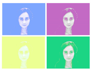 I decided to try out a different style of the work by Warhol, as i felt this would add more variety to my work. To create this effect, I originally took an image on photobooth and dragged it into photoshop elements. i first used the magnetic lasso tool, to select my chosen area within the image. I then went to the toolbar at the top and selected image - mode - grayscale. I later selected the layer adjustment tool and went down to brightness and contrast. I changed the brightness of my image to +25 & changed the contrast too +55. Next, i went to image - mode - RGB and duplicated the image. Using the duplicated image, i changed it to soft light to try and make my image more visually pleasing. i created a new layer on top of the layer which i had duplicated and i then filled it with colour. using the same settings as previous i selected the colour layer and selected lighten. i repeated this style of Warhol image to create this overall effect, i believe it has worked well and showed the style which i wanted to portray.
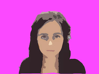
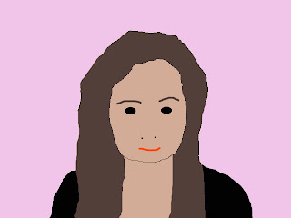 I Started to create this effect by capturing a new image on PHOTOBOOTH. After opening the photo on PHOTOSHOP ELEMENTS, I selected the part of the photograph i wanted to use using the marquee section tool. I clicked EDIT > COPY, went onto a blank page and clicked EDIT > PASTE. I then created a new layer and called it HAIR. Using the lasso tool, i traced around my hair making sure you 'hair' layer is selected. Now i used the colour palette and chose a colour that was suitable to represent my hair. Using the PAINT BUCKET TOOL, i filled my hair. When trying to re-create the other areas in the photograph e.g. eyes, mouth, items of clothing etc. you follow the same technique in order to create an overall visually pleasing final image. Finally, make one last layer and move it to the back ensuring all the over layers are ontop and fill it with a colour. To see the finished piece make sure all the layers you want to be seen are visable.
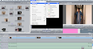
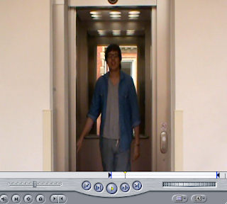 The print screens of the different settings and techniques we used to edit our music video to create an overall visually pleasing final piece. It was important throughout that we kept rendering the product for us to make sure the lip sync looked accurate and was in time with the original soundtrack. Aswell to get the right shots of the music video we used the in and out marker tools. After choosing the selection i wanted to use i dragged it onto the timeline and tried to ensure the timing was correct throughout. I was really pleased with the final outcome, although i felt they were areas which could have been improved. An example of this was how areas of the videos switched to black inbetween shots in different locations, i felt this didn't give the overall effect which i was aiming for. The next time i create another music video, i hope to use alot more shots to create a more visually pleasing finish.