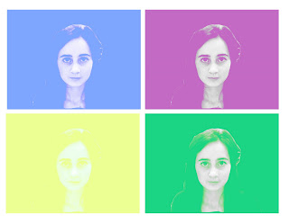
 I decided to try out a different style of the work by Warhol, as i felt this would add more variety to my work. To create this effect, I originally took an image on photobooth and dragged it into photoshop elements. i first used the magnetic lasso tool, to select my chosen area within the image. I then went to the toolbar at the top and selected image - mode - grayscale. I later selected the layer adjustment tool and went down to brightness and contrast. I changed the brightness of my image to +25 & changed the contrast too +55. Next, i went to image - mode - RGB and duplicated the image. Using the duplicated image, i changed it to soft light to try and make my image more visually pleasing. i created a new layer on top of the layer which i had duplicated and i then filled it with colour. using the same settings as previous i selected the colour layer and selected lighten. i repeated this style of Warhol image to create this overall effect, i believe it has worked well and showed the style which i wanted to portray.
Tuesday, 25 May 2010
Warhol image 2
 I decided to try out a different style of the work by Warhol, as i felt this would add more variety to my work. To create this effect, I originally took an image on photobooth and dragged it into photoshop elements. i first used the magnetic lasso tool, to select my chosen area within the image. I then went to the toolbar at the top and selected image - mode - grayscale. I later selected the layer adjustment tool and went down to brightness and contrast. I changed the brightness of my image to +25 & changed the contrast too +55. Next, i went to image - mode - RGB and duplicated the image. Using the duplicated image, i changed it to soft light to try and make my image more visually pleasing. i created a new layer on top of the layer which i had duplicated and i then filled it with colour. using the same settings as previous i selected the colour layer and selected lighten. i repeated this style of Warhol image to create this overall effect, i believe it has worked well and showed the style which i wanted to portray.
Saturday, 22 May 2010
Warhol image 1
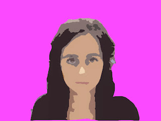
To create this Warhol effect, i took a photo on photobooth, put it into photoshop, and cut it out and deleted the background. I then filled the background with a solid colour of my choice which was a bright pink. After i i needed to SMART BLUR the image (it was important i didnt blur the background and just selected myself.) As i progressed i always tried to create duplicate layers of the photo, just incase i made any mistakes and didnt turn out the way i wanted it too. I went to the menu and selected FILTER > BLUR > SMART BLUR. I set the radius to around 40 for a high resolution. I varied the Thresold up and down a little until i was pleased with the outcome of the blur. Then making sure the blurred photograph was selected i went to FILTER > ARTISTIC > CUTOUT. I set the Levels at 5, Edge Simplicity at 2 and the Fidelity to 1. To finish my image i altered the Hue and Saturation until i was happy with the colour.
Opie image
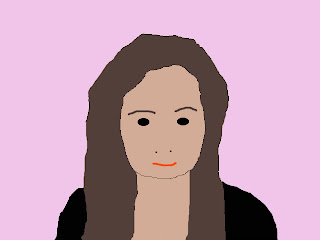 I Started to create this effect by capturing a new image on PHOTOBOOTH. After opening the photo on PHOTOSHOP ELEMENTS, I selected the part of the photograph i wanted to use using the marquee section tool. I clicked EDIT > COPY, went onto a blank page and clicked EDIT > PASTE. I then created a new layer and called it HAIR. Using the lasso tool, i traced around my hair making sure you 'hair' layer is selected. Now i used the colour palette and chose a colour that was suitable to represent my hair. Using the PAINT BUCKET TOOL, i filled my hair. When trying to re-create the other areas in the photograph e.g. eyes, mouth, items of clothing etc. you follow the same technique in order to create an overall visually pleasing final image. Finally, make one last layer and move it to the back ensuring all the over layers are ontop and fill it with a colour. To see the finished piece make sure all the layers you want to be seen are visable.
Lip Sync
We used a practiced lip sync to gain knowledge of the software (Final Cut) which we will be using next year, it was important for us to learn how to practice lip syncing the song to the footage. As a group we found it easier for our actor to actually sing the song because it would be easier or us to get the track accurate to the lip movements. After importing the video itself we imported the track into Final Cut Express. We recorded our actor in a variety of locations to allow our music video to have more depth.
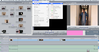
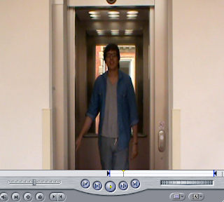 The print screens of the different settings and techniques we used to edit our music video to create an overall visually pleasing final piece. It was important throughout that we kept rendering the product for us to make sure the lip sync looked accurate and was in time with the original soundtrack. Aswell to get the right shots of the music video we used the in and out marker tools. After choosing the selection i wanted to use i dragged it onto the timeline and tried to ensure the timing was correct throughout. I was really pleased with the final outcome, although i felt they were areas which could have been improved. An example of this was how areas of the videos switched to black inbetween shots in different locations, i felt this didn't give the overall effect which i was aiming for. The next time i create another music video, i hope to use alot more shots to create a more visually pleasing finish.
Subscribe to:
Comments (Atom)